Downtown Condo Living Offers a Fresh Take on Home

[fullwidth padding=”5″ padding_top=”5″ padding_bottom=”5″ padding_top=”5″ border=”false” background=”false” background_image=”” container=”true” parallax=”false” overlay=””]

For a Madison couple experiencing the proverbial ‘empty nest,’ creating a second venue to cultivate their new lifestyle has yielded some amazing results.

Echoing the new rhythms of a life with grown children, this downtown location with ‘big picture’ views of the city is ideal for welcoming new experiences and perspectives of all types.

Keeping the surroundings crisp and clutter-free makes ample space for the couple’s own design improvisations in the form of various artifacts and ephemera collected along the path of a life well-lived.

Without sacrificing an ounce of style, a predominantly neutral palette interwoven with key elements of soothing color and smaller scale pattern is what keeps seemingly disparate pieces in perfect harmony with one another.

Playful touches like the authentic bowler hats fashioned into kitchen lighting are the perfect capstone to a design that is both established and evolutionary at the same time.

living-room

Redesign Celebrates Game Day Splendor on a Whole New Level

[fullwidth padding=”20″ padding_top=”20″ padding_bottom=”20″ padding_top=”20″ border=”false” background=”false” background_image=”” container=”true” parallax=”false” overlay=””] [spacer height=”0″ /]

living-room

Has anyone yet coined the phrase “Badger Luxe” to describe a design style?  Perhaps we should, as this condo brings it in spades.

bar

Custom cabinetry and resplendent finishes throughout complement the glass perimeter with spectacular views of the Madison skyline.

bedroom

bathroom

High-impact red, inspired by the iconic University color, is distributed throughout the space to keep pace with an abundance of game day spirit.

[/fullwidth]

Office & Bedroom Transformation

[fullwidth padding=”5″ padding_top=”5″ padding_bottom=”5″ padding_top=”5″ border=”false” background=”false” background_image=”” container=”true” parallax=”false” overlay=””]

“Now I just love it!” describes a client’s reaction to the dramatic transformation of a small office into an inspirational retreat and healing space. This was objective for Zander’s Interiors’ first of many projects with one of our clients whose initial sentiment about her space was not very optimistic. “I thought I was doomed – I hated my office and couldn’t visualize it being any different… it was too small and everything was pushed up against the wall.” Senior designer Michelle Hackworthy set about helping her client reinvent her space to be “fresh and feminine…with pretty things,” including key pieces from the client’s artwork collection. The result is a design deeply attuned to the client while being both beautiful and functional.

zan-1957_photo-1730-6-retouched_v1_web

Michelle developed four to five options for a scenario that would realize the client’s aspirations for her space. As their work progressed, the only element that remained unchanged was the overhead fixture. The total re-design is anchored by an elegant writing desk that floats in the space; replacing a roll-top desk and giving immediate relief to the wall space. Also developed for the space were highly functional ‘cubbies;’ a creative storage solution that delighted the client. A traditional office chair was substituted with something softer, as the client didn’t want a ‘typical’ office look. In addition, Michelle used layers of color to create a fresh and airy look in order to create a departure from the rich burgundy and fall tones featured in other parts of the house. Defining the space as unique and separate helped everyone identify the office as the client’s private retreat.

zan-1957_photo-1724_retouched_web

To enhance the feel of rest and relaxation, a generously proportioned matelasse chair in creamy tones overlooks the client’s award-winning back yard. “I want to spend all of my time there,” observes the client. The luxury of an ottoman featuring the same creamy tones was the biggest surprise for the client. “I couldn’t believe that could fit in the space. Michelle knows how to choose the right dimensions for the room,” she says while appreciating the value of her expertise. “I won’t waste money buying the wrong thing.”

In retrospect, the client is amused that she considered some of her selections for the office “edgy” at the time. Most notable, the client challenged herself embrace pattern and color with her window treatments in her office space. “Michelle helped me break out of my typical mold…it was a huge thing for me to do that!” For the client, having thoroughly enjoyed the results of taking a few personal risks built a trust and partnership with Michelle to re-design more spaces in the client’s home.

zan-1957_photo-1769-22-retouched_1_web

For their next collaboration Michelle and her client tackled the master bedroom in much the same manner as the office. The objective was to incorporate existing wood case pieces while generating more light and color throughout the space. The first decision was to replace the current wood sleigh bed with a new upholstered bed with a more subtle profile. Laughs the client, “It’s the first time we ever had a queen size bed! It made a big difference.”

To bring balance to the space, Michelle and her client incorporated “strong male input,” as described the client. They looked to create a space that was whimsical “but not too frilly,” demonstrated by selection of a colorful yet sophisticated dot embroidery pattern on window treatments that was repeated on pillow shams. The coverlet cover selected for the bed features a pattern that is colorful and bold, yet softened by the look of being painted on the fabric. More balance was achieved in the master by finding a twin for an existing nightstand and placing atop both of them matching ceramic lamps in a light tone.

The light colored bench found in the master is just one example of Michelle’s ability to find the ideal combination of both form and function for her clients. “I love it, I can even lay on it,” remarks the client. Michelle recommended the piece in order to navigate the presence of a large radiator in the same location. It succeeded on several fronts by also giving the room a cleaner look; thus transforming a former “dead space” into an ideal place for repose.

[hr /]

The inspiration provided by this gorgeous new master bedroom has set Michelle and her client on the path toward renovating the master bath. The next big reveal promises an opportunity to daydream about your next project, so stay tuned…

Before & After

[fullwidth padding=”5″ padding_top=”5″ padding_bottom=”5″ padding_top=”5″ border=”false” background=”false” background_image=”” container=”true” parallax=”false” overlay=””]

beforeafter_1

Imbued with color inspiration from the 1930’s, the massive style capacity of this home is demonstrated over 15 years of artful adaptation in the living and dining rooms. An analogous color scheme with prominent aqua and green tones popular in the 1930’s first graces the living room to creatively infuse a traditional French style. Bergère chairs flank the large focal fireplace with its classical use of stone and versatile dentil trim molding. Coordinating colors in boldly-striped silk shantung bring the acanthus leaf chandelier comfortably into the 20thcentury; only to be jettisoned even further with the room’s next iteration.

beforeafter_look_4

beforeafter_look_2

Still with a nod to the 1930’s color palette, bolder tones of orange and rose with smaller stripes later reinvent the saber legged dining room chairs to skillfully incorporate smoky hues on the walls. Sketchy floral print drapery revises the room by bringing a joyful eclecticism, ever expanding the potential of the space to bring in new influences. A curved back chair reminiscent of the 1930’s set beneath decidedly 20th century artwork; further showcasing the room’s latest use of more streamlined forms. The more transitional upholstered chairs and ottoman craftily unify a more diverse portfolio of furnishings and artwork, as does the continuation of deep tones in thought both spaces.

beforeafter_look_5

beforeafter_look_3

Invigorated once again with a third look, the living and dining areas are dramatically transformed with a backdrop of soft neutral punctuated by juicy pops of color introduce a new sense of depth and character to the space. Articulated beautifully in the artwork, colors keep the eyes dancing and creativity flowing yet they allow the space to also nurture relaxation and calm. A bold statement on the windows maintains the necessary balance in the dining room for its chandelier; miraculously staying right at home with each redesign. The familiar is successfully re-imagined to prove once again that the perennial beauty of a well-crafted home, furnishings and accessories can be made to embody our unique sense of style at every stage of our lives.

Switching it Up - Main Living Area

Switching It Up

[fullwidth padding=”20″ padding_top=”20″ padding_bottom=”20″ padding_top=”20″ border=”false” background=”false” background_image=”” container=”true” parallax=”false” overlay=””] [spacer height=”0″ /]

doug-zander-designer


While moving and redecorating might be seen as a burden for some, for one Madison couple, it’s a challenge to willingly and happily accept. For their most recent switch-up, they enlisted the help of Zander’s Interiors owner, Doug, to give the home a new and updated look.


 Switching it Up - Main Living Area

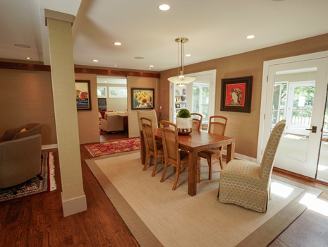
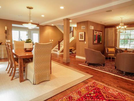
“Because these homeowners like to change things up pretty often, the challenge in this project was to make the space something unlike anything they’ve done in the past,” explains Doug, as he moves into one of the home’s sitting areas. “We pulled out the carpet in the great room and put in hardwood floors, and painted the dark baseboards white, so this was definitely a big change. In the end, we went for a warm, transitional style – meaning that we used modern and traditional pieces together to get something totally new.”

Switching it Up - Living Room Columns Switching it Up - Main Seating Area

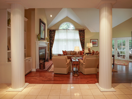
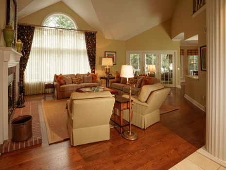
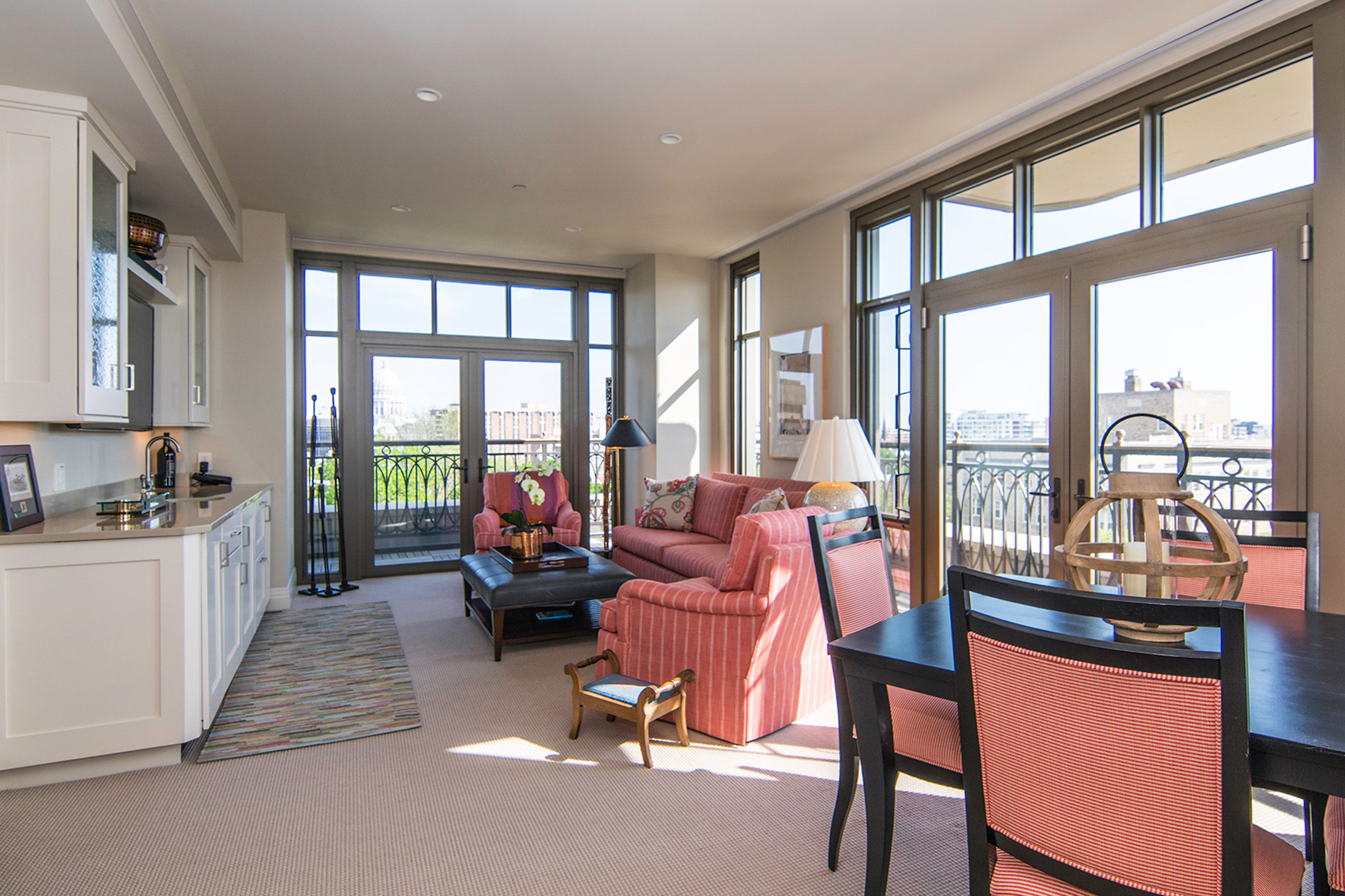
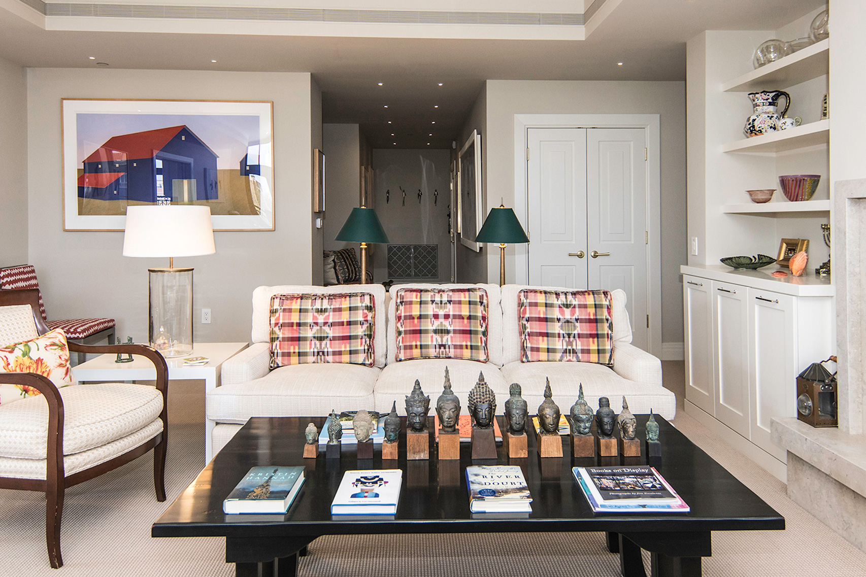
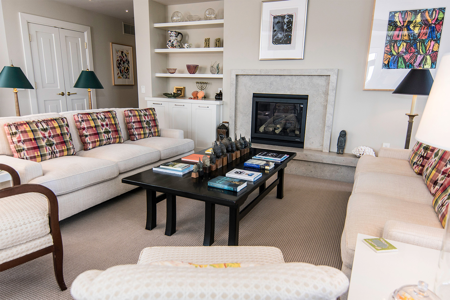
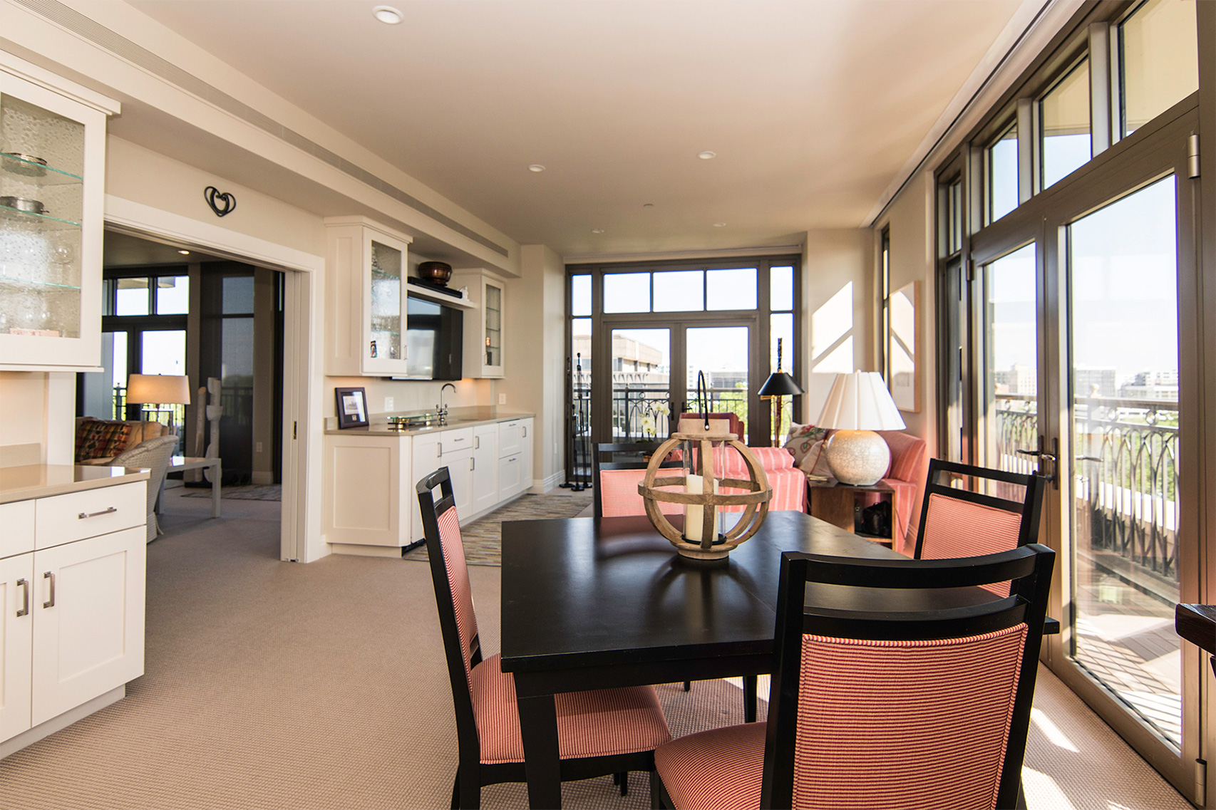
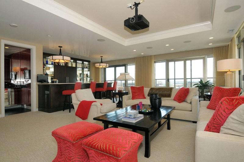
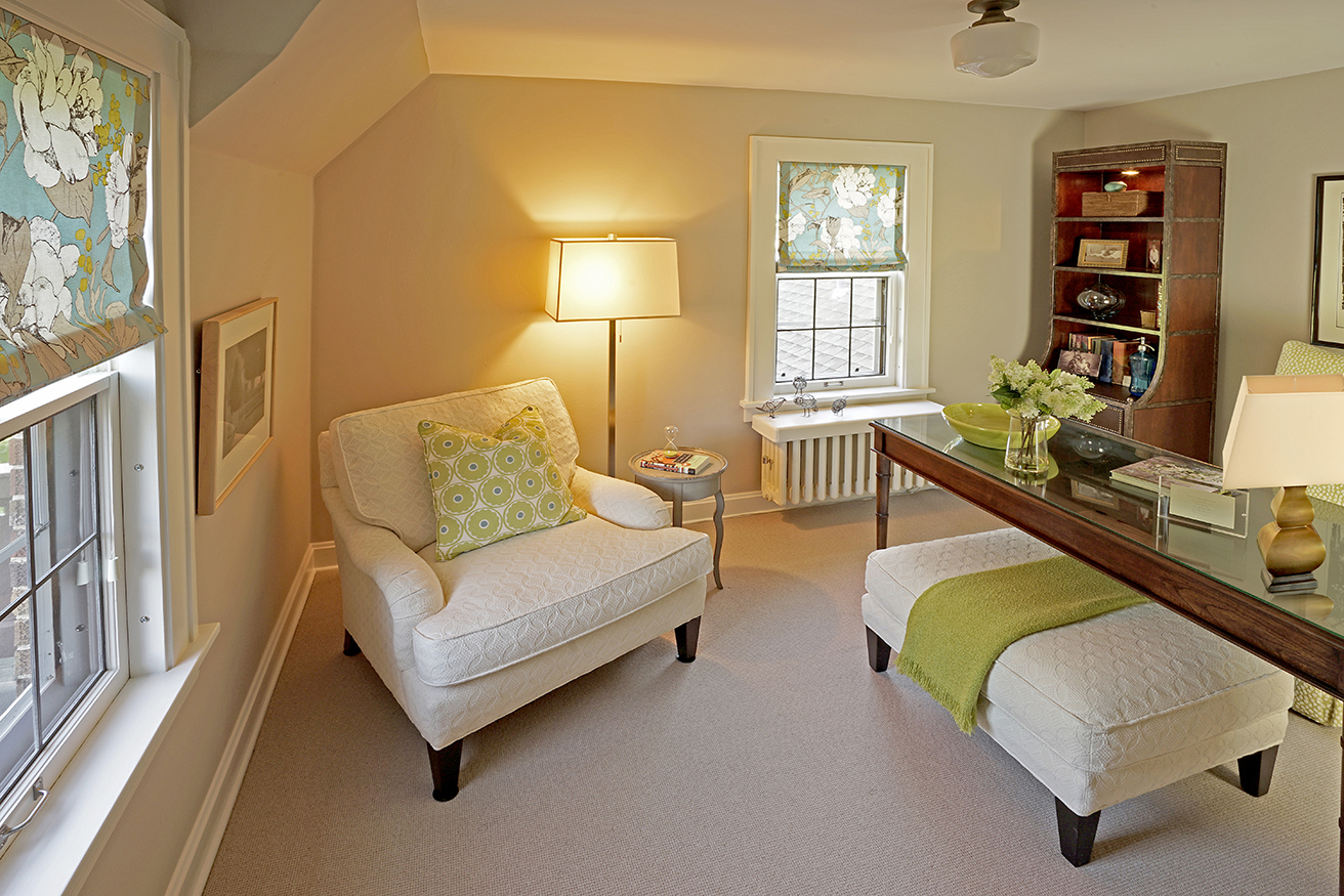
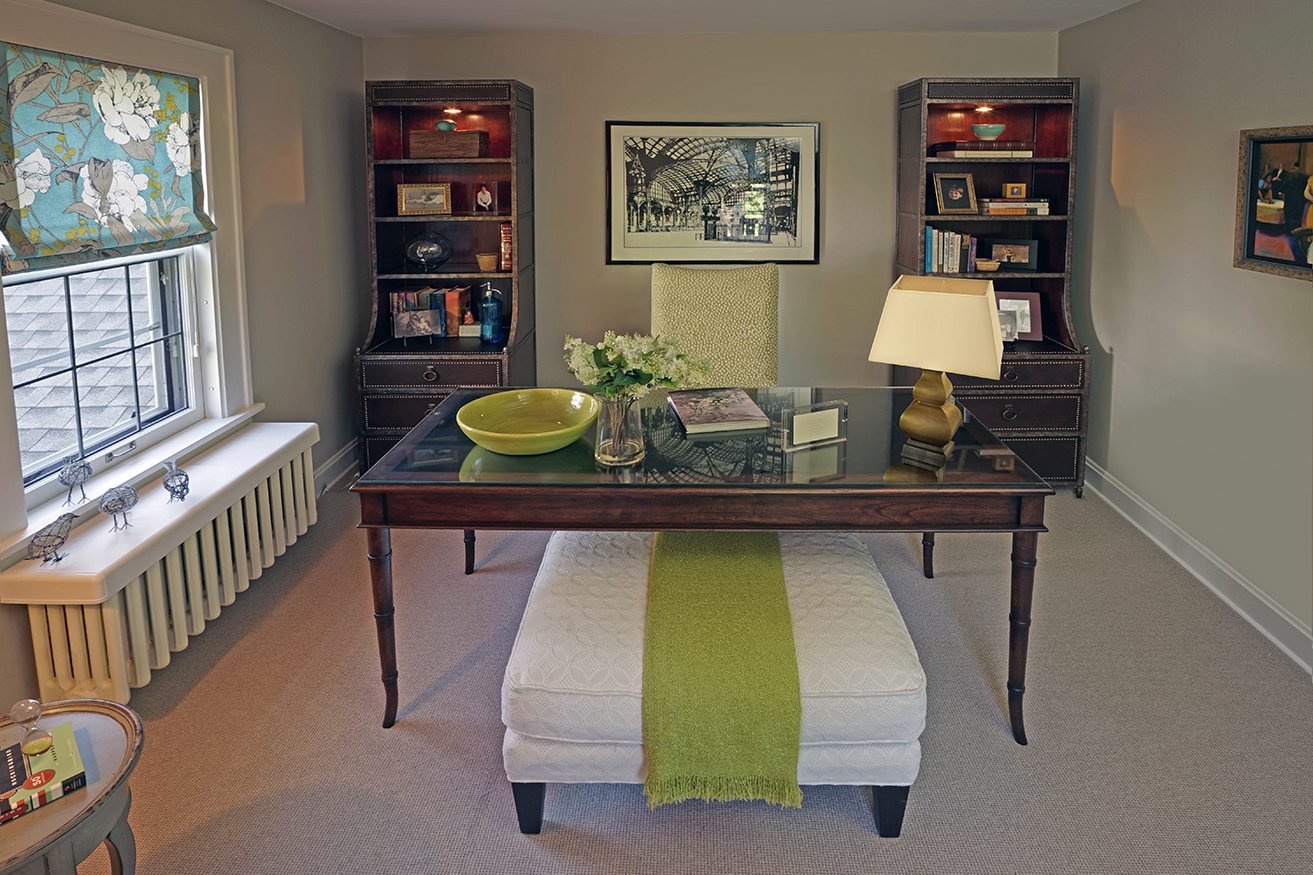
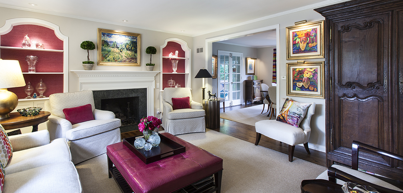
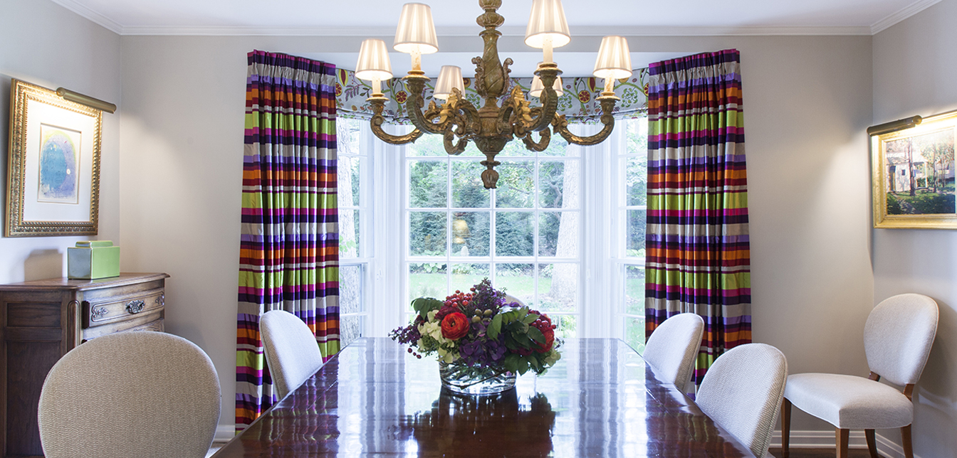
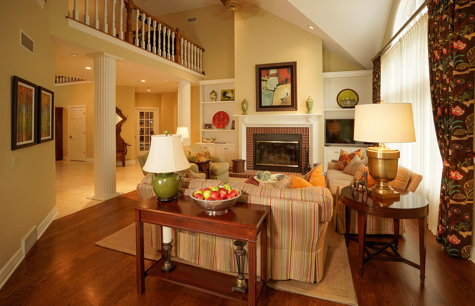
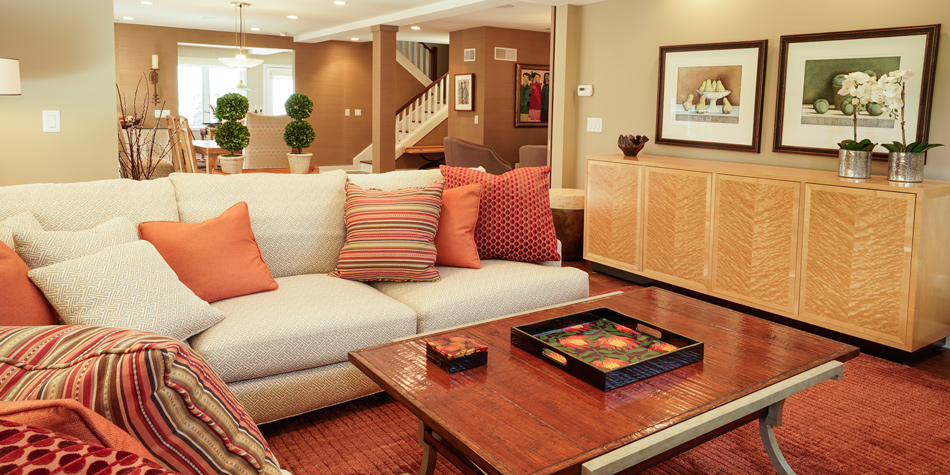
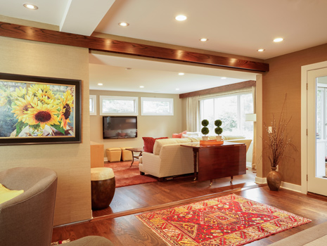
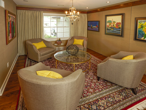
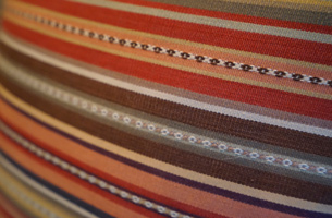
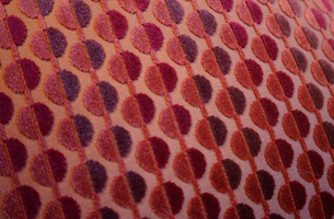
This trend of mixing traditional and modern elements carries throughout the home. Downstairs, in the main living room, Doug notes the different textures from the striped couches to the floral curtains. “By keeping the walls and main furniture neutral, we got to play with adding color here and there in the pillows, rugs and artwork. Overall, the bright colors like the orange of this pillow or the green of that lamp play against the dark wood floor to bring that visual interest to the room.”

Switching it Up - Kitchen Island

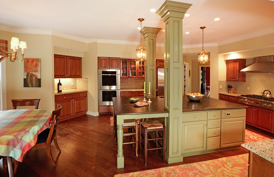
 “The kitchen had a big transformation,” Doug explains as he moves out of the living area. “Before, it was stuck in the 1990s. In order to bring it to the present, we had to update the lighting to make the space brighter, and we added the island to provide much-needed counter space.” Doug also points out the more traditional metallic accents in the room, noting how they play off the rustic green paint on the island cabinetry. He also notes how the textured rugs increase visual interest and dampen noise in this highly trafficked location.

Switching it Up - Master Bedroom

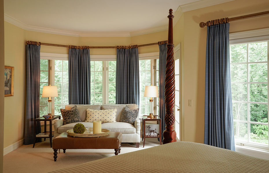
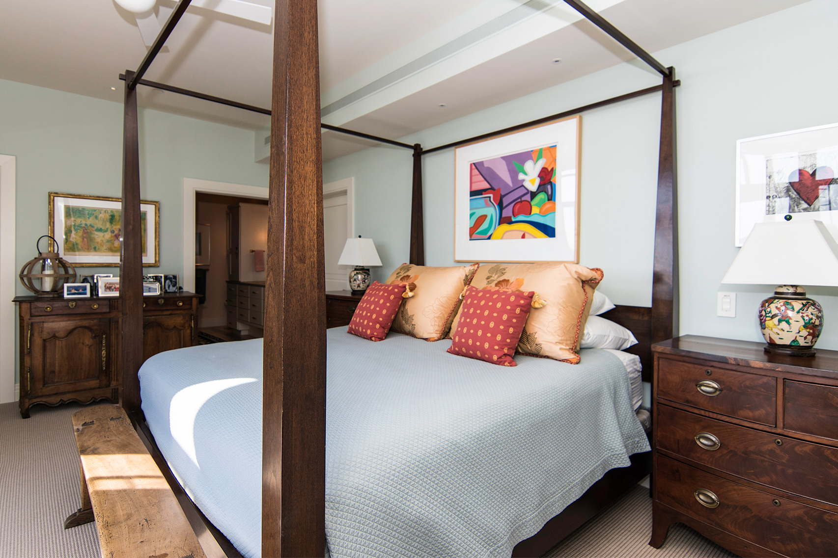
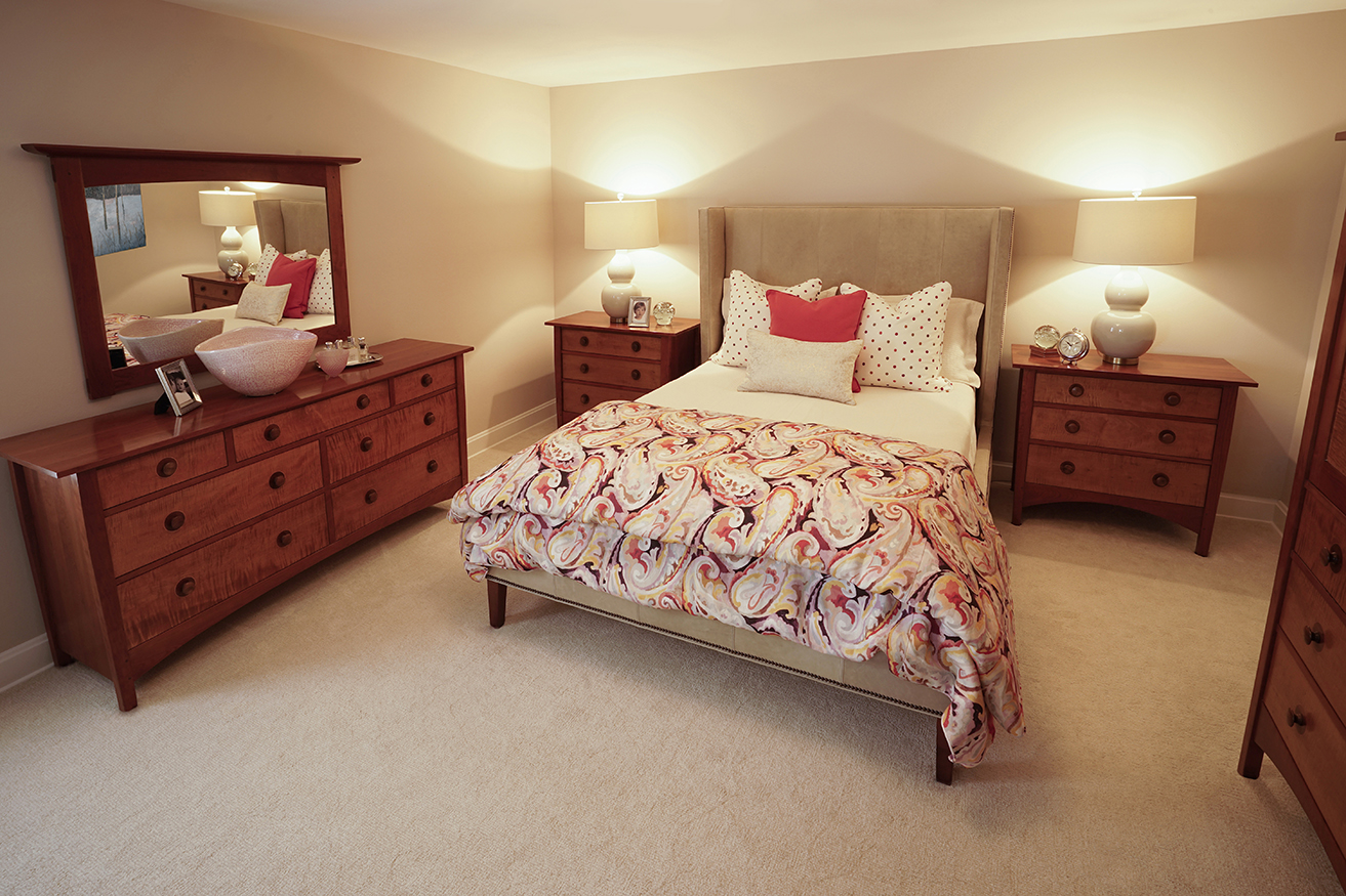
Next, Doug describes how the master bedroom ties in with the rest of the home, but still feels unique. “The warm neutrals are still seen here, like in the walls and the comforter, but the accents are a soft blue, making for a more calm environment.” He notes the sitting area with large windows behind it and says, “we provided the window treatments for both decorative and practical needs – they block out all the light when drawn, but provide a beautiful frame for the scenic view when open.”

Switching it Up - Master Bathroom Switching it Up - Master Bath, Tub and Shower

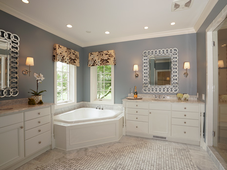
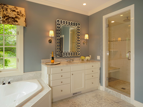
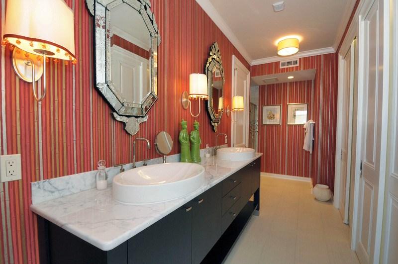
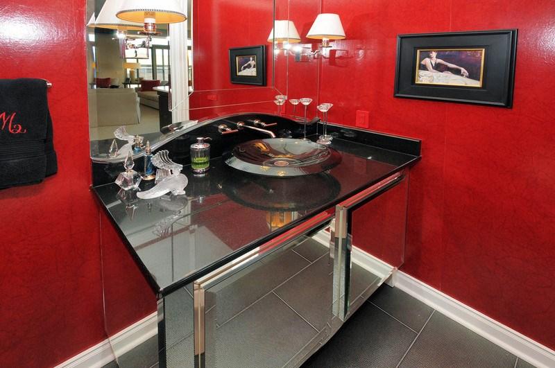
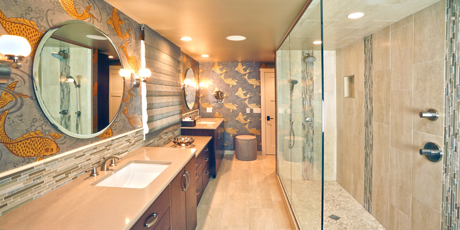
The soft blue as seen in the master bedroom is seen on the walls of the master bathroom, where unlike most of the home, the woodwork and other surfaces are white or grey, instead of dark. Doug explains that this gives the bathroom a more modern, clean look, while still incorporating traditional pieces, like the light floral pattern of the window treatments.

[hr /]

Mixing modern and traditional elements in the design of the home provided the perfect solution to the owner’s need for change. Doug’s switch-up brought a fresh look and style to each and every room.

[/fullwidth]

Blank Slate Header

BLANK SLATE

[fullwidth padding=”20″ padding_top=”20″ padding_bottom=”20″ padding_top=”20″ border=”false” background=”false” background_image=”” container=”true” parallax=”false” overlay=””] [spacer height=”25″ /]

Diana Erfurth, Designer


A home severely damaged by a storm became an opportunity to start fresh on this casual living bungalow. The home-owners, guided by Zander’s designer Diana Erfurth, decided to take their new blank slate and make the home exactly what they had always wanted it to be.


Blank Slate Header

“The ideas and clear visions from the owners were instrumental in the process of redesigning the home, and their direction is evident – one of the most important aspects of the new design to them is that the existing spaces are being used as effectively as possible,” starts Diana. The main area of the home is a great example of this, as it contains multiple features which make the area functional for a couple who loves to entertain, all while adding as much style as possible. “Most notably, movable walls are now included between areas of the main floor, adding immense versatility in the way the space can be used.”

Living Room Slider Closed Blank Slate Living Room Slider Open

Diana points to the console table located behind the sofa.  “This was carefully selected to serve multiple functions.”  She goes on to explain how the large drop leaf is a space saver when not in use, but when the walls are opened up, the leaf pops up and becomes a quick food and beverage centerpiece to any impromptu party.

Blank Slate Dining Room  Blank Slate Sitting Room

The main seating area boasts a neutral base, with multiple colors added in carefully through rug and pillow accent pieces. Textures are layered on through the use of grasscloth wall coverings and a variety of upholstery choices.  “The chandelier in this conversation area is one of the owner’s favorite pieces.” Diana informs.  “The space was designed to center around it.”

Blank Slate Stripe Detail Blank Slate Sitting Room Detail Blank Slate Dot Detail

Texture, color and shapes are repeated and carried over into the design of other rooms in the home as well.  For example, the master bathroom.  Unique textures are showcased on almost every surface, and a silver and cream color palette is accented with gold finishes.

bathroom-full

A special design feature of the bathroom is the shower.  Diana determined that designing it to be long and slim, while eliminating the need for a door would best utilize the space.  “The shape of the shower, together with the use of glass walls, makes the narrow bathroom space appear more open.”

 bathroom-texture-tile Blank Slate Bathroom Wallpaper Blank Slate Bathroom Floor Detail

Neutral colors and stone paired with the gold pops of color in the wallpaper creates contrast with a lot of visual appeal and adds an elegant twist on a classic bathroom theme.

[hr style=”1″ /]

No detail was left out when Diana took this quaint, blank slate and created the multi-functional, stylish home the owners had always dreamed of.

[/fullwidth]